
App Audit
User research
Usability Testing
Prototyping
Lorem ipsum dolor sit amet, consectetur adipiscing elit, sed do eiusmod tempor incididunt ut labore et dolore magna aliqua. Ut enim ad minim veniam, quis nostrud exercitation ullamco laboris nisi ut aliquip ex ea commodo consequat. Duis aute irure dolor in reprehenderit in voluptate velit esse cillum dolore eu fugiat nulla pariatur.
Block quote
Ordered list
Unordered list
Bold text
Emphasis
Superscript
Subscript
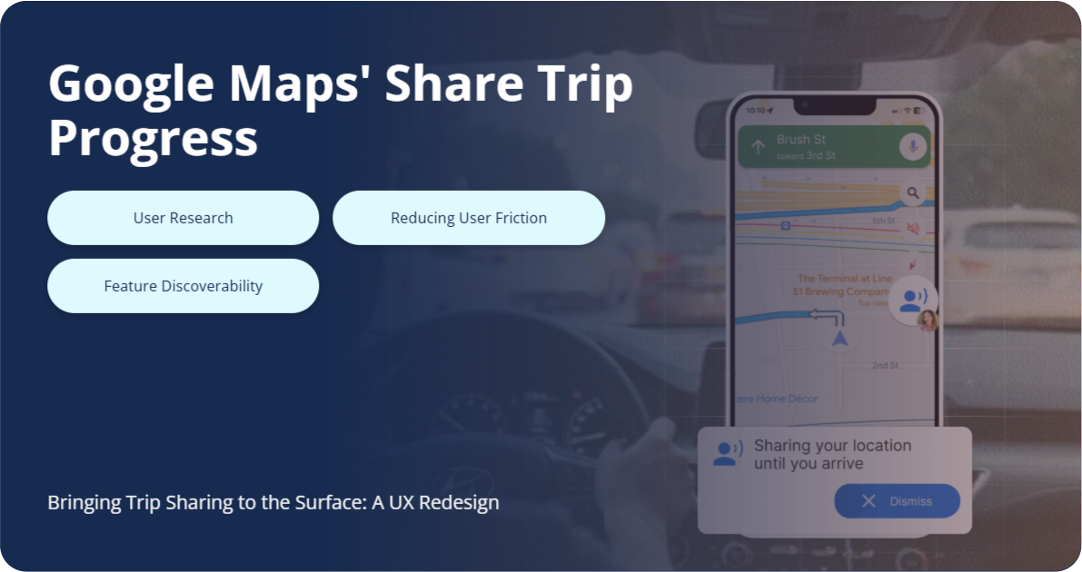
Problem: Google Maps' "Share Trip Progress" feature is hard to find and use, leading to missed real-time updates and user frustration.
Approach: This case study outlines a user-centered redesign based on research from domain analysis, user interviews, and online forum discussions.
Solution: The redesigned feature is easily accessible at the start of a trip. It sends live updates via push notifications, making real-time tracking simple for both the driver and the recipient.

.gif)

Safety concerns have driven the tech industry to integrate location-sharing features, but many users prefer temporary sharing options. Google Maps' "Share Trip Progress" feature addresses this need, yet it suffers from poor discoverability. Our research, including user interviews, shows the feature is often completely unknown to users. We identified two core problems: poor discoverability and usability, which hinder users from finding and effectively using the feature.
I started by looking for similar features in other apps for inspiration and any gaps in existing products.
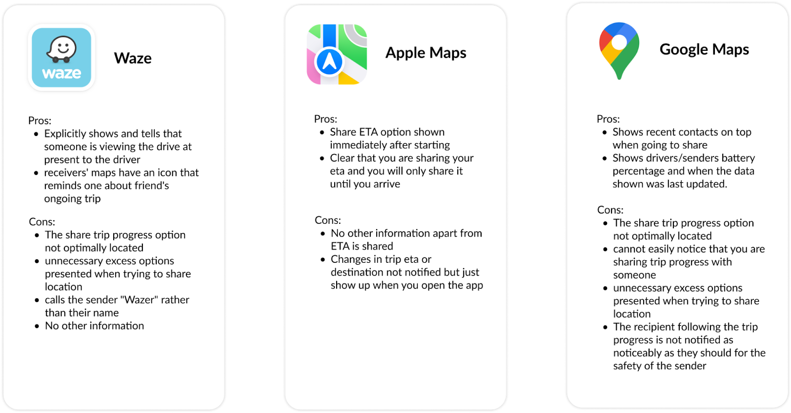
Apple Maps places the ETA share option effectively, but none of the products provide an easy way for recipients to receive trip progress updates—rendering the feature useful only if both parties can access it, a gap that needs to be addressed.
To understand user pain points, I used two research methods:
Reddit offered fast access to candid user feedback.
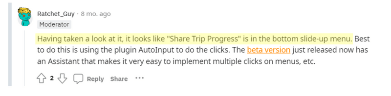
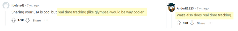
While I initially wasn’t sure I’d find relevant data, I uncovered extensive discussion and consistent themes:
These insights reinforced that improvements to the feature must be highly visible and intuitive to interrupt established user behavior and close the feedback loop—especially ensuring recipients receive timely updates.
I interviewed 8 daily Google Maps users to understand their awareness of the Share Trip Progress feature and behaviors around location sharing for safety.
Key Findings:

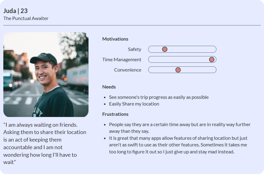
These pain points and user needs were translated into user personas for further design exploration.

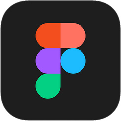
The current share trip progress feature has two different user flows : 1) the Sender, 2) the Receiver (Screens below shows only a part of the entire user flow)
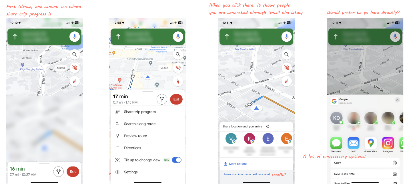
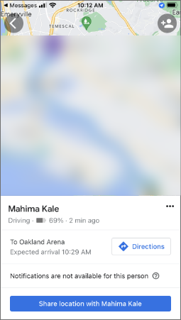
This page is effective, it is to the point and very clear about the ETA, phone battery of the person, when the page was last updated, and where the person is going.However user testing and research has revealed that the receivers have trouble re-checking or re-visiting the trip updates.Question for feature feasibility understanding : Why is there a statement that says "Notifications are not available for this person". What does it mean?
The Zeigarnik effect says we are more likely to remember incomplete tasks. Many of my participating interviewees "forgot" that they had someone's trip progress shared with them. As humans, we naturally seek closure. Incomplete tasks keep us focused on what's left, while completing them relieves tension and lets us move on. Decided to incorporate Zeigarnik effect to this feature by adding a progress bar as notification.
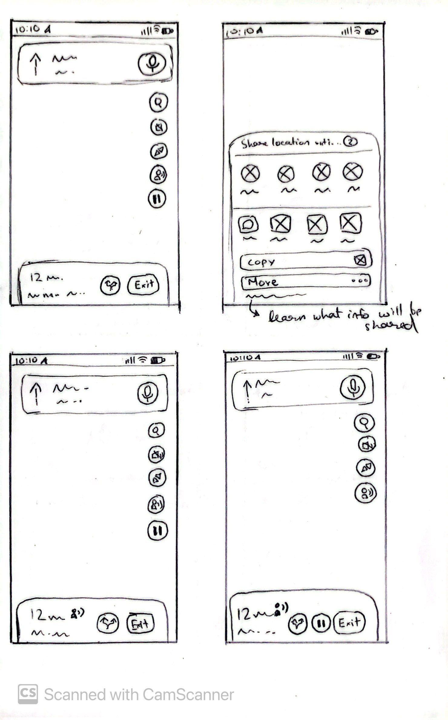
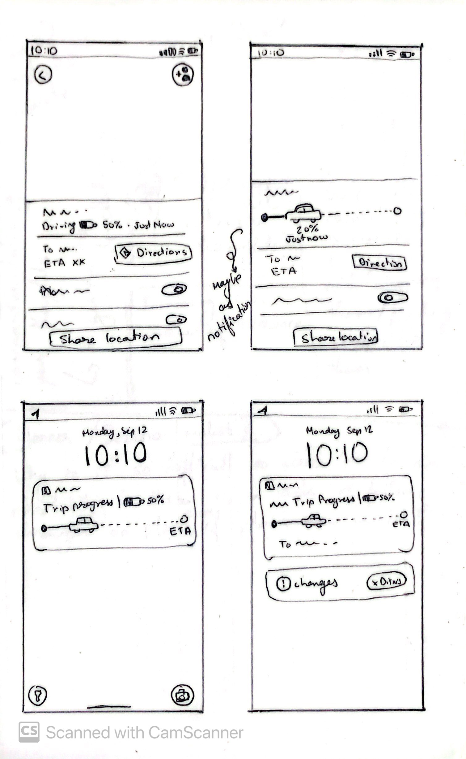
Most of these wireframed design changes seem straightforward with my understanding and experience with frontend development. However, one aspect that I never dabbled with is notification systems. If this were a project with a team of engineers this would be my biggest concern about changing the design of the Google Maps notification system. However, as this is not the case, I looked into, that is, researching notification design systems myself to understand the feasibility of this design.
Due to time constraints, I decided to focus on IOS notification systems. Reading through Apple Developer Documentation I found out that it is in fact possible to edit the visuals of notifications the way I have wireframed. The following is the summary of my findings for good notification design practices research:
.gif)
.gif)
The design impact of the research findings highlights critical usability and communication gaps in Google Maps' trip progress sharing feature. The design changes, showcased above, improve the usability of this feature by:
Enhancing Discoverability – Making the "Share Trip Progress" option more accessible to reduce friction in finding the feature, especially for senders who may already be driving.
Seamless Re-Entry – Ensuring that recipients can easily navigate back to the trip progress screen after exiting the app or switching attention.
Persistent Tracking– Improving real-time updates for recipients when the ETA changes significantly to enhance reliability and trust in the feature and ultimately the app.
Minimizing Driver Distraction and Maximizing Driver Safety – One-tap access to share trip progress allows drivers to quickly and safely update their location without navigating through multiple menus while driving.
By refining these aspects, the user experience is more intuitive, reducing friction and increasing the effectiveness of trip-sharing for both senders and recipients.